Part 6 A School is Born - Wayfinding
2024.06.24
![]() Share
Share
In this chapter we will explore the innovative, but seemingly simple, design concept of wayfinding through color. From the vibrant exterior to the carefully coordinated hues within each classroom, color plays a pivotal role in guiding students and staff through the space with ease and confidence. By strategically employing color-coded elements such as doors, walls, and floors, we create a cohesive and intuitive wayfinding system tailored to young children. This approach ensures that students can develop strong core memories of their surroundings, fostering a sense of familiarity and belonging within the school environment.
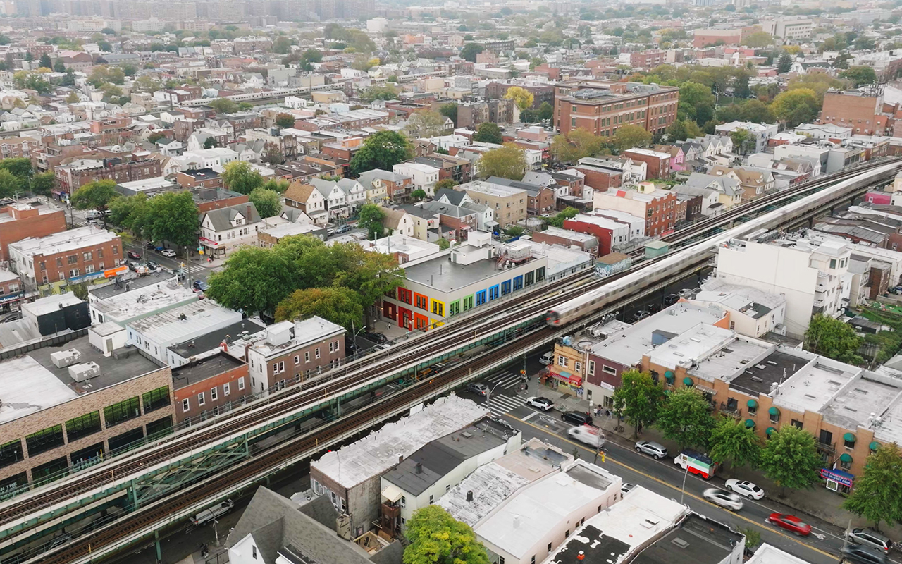
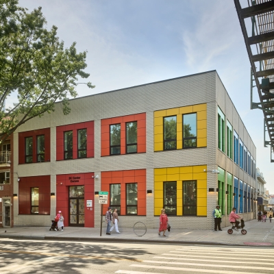
The exterior of the school is made of brick with metal panels featuring bold, bright colors that immediately capture attention and create an inviting atmosphere in an otherwise fairly gray neighborhood block. The colors are arranged to transition from cooler shades, starting with a darker purple hue near the emergency exit, to brighter, warmer colors as you turn the corner, culminating in a striking red at the main entrance. This arrangement visually guides students along the side of the building, coming from the train station, creating a natural flow and sense of direction. The idea was to create a “beacon” for students, making it easy for them to identify their school building from a distance and providing a warm welcome each day.
The idea was to create a “beacon” for students, making it easy for them to identify their school building from a distance and providing a warm welcome each day.
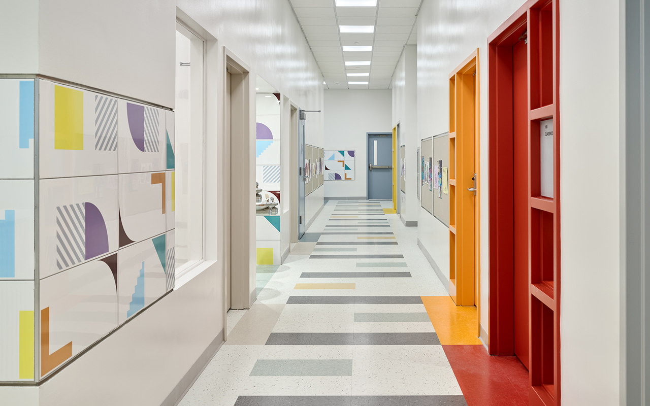
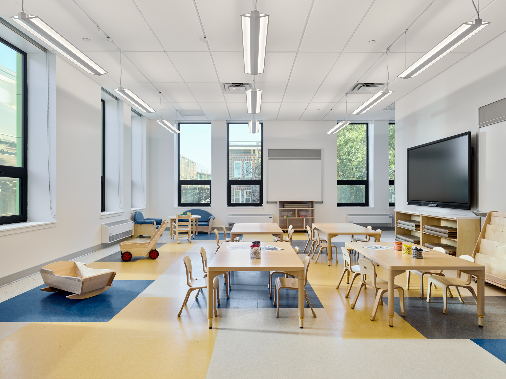
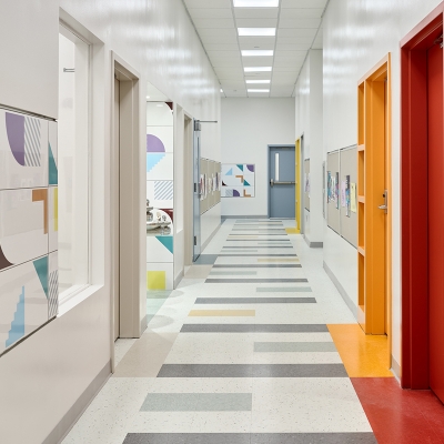
Inside, hallways are full of bright colors in the wall tile and VCT floor patterns that lead to color-coded doors, each signifying its respective unique color-coded classroom. This system is a simple yet effective wayfinding tool, fostering independence in the children by allowing them to move freely to their designated classrooms. As they navigate the hallways, the walls proudly showcase their own work, reinforcing a sense of pride and ownership.
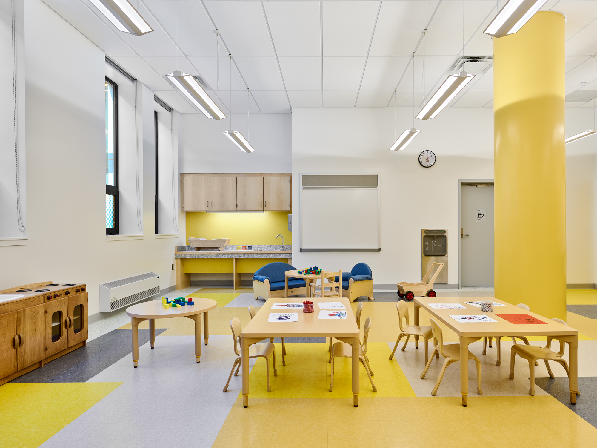
Interior patterns are coordinated to match the primary color of each classroom. The familiarity of these colors in their daily routine provides a sense of security and comfort, while the color-coded columns act as the figurative and literal pillars of each space.
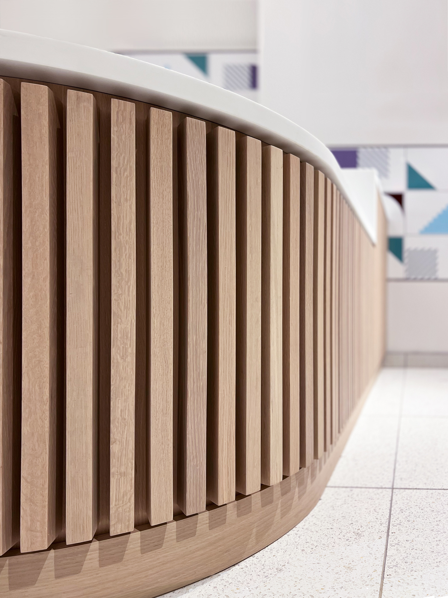
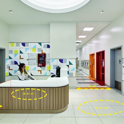
Additional colors throughout the school include colorful tiles that integrate hues from different parts of the school. The use of natural materials, such as wood, in the central lobby desk provides a warm, welcoming touch that greets children as they start and end their day. This combination of colors and natural elements creates a balanced and engaging environment for all students.
By integrating color into our school's design, we have created an environment that is not only aesthetically pleasing but also highly functional. The wayfinding system through color empowers young students to navigate their school independently, creating a sense of ownership and confidence long before they learn how to read.

![]() Share
Share